Henry Westons — Heritage, Reimagined
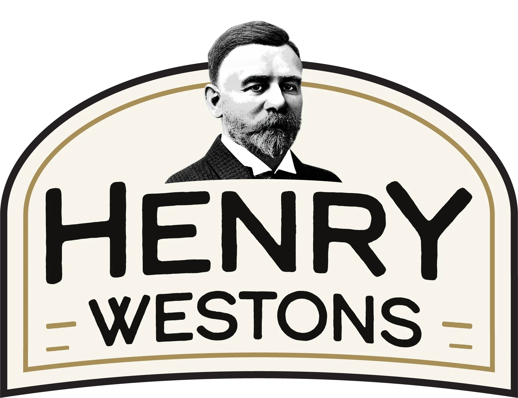
For this Henry Westons brand redesign, I set out to modernise the identity while preserving the heritage and character that make the brand distinctive. The redesign introduces a cleaner, more refined visual system, strengthening the typography, hierarchy and overall composition while retaining the traditional portraiture, muted cream and antique-gold palette, and vintage-inspired styling. The result is a more confident and contemporary identity that feels appropriate for modern packaging while still communicating the craftsmanship, history and authenticity associated with a long-established cider brand.
Henry Westons Rebrand, Personal Project, 2026
- Brief
- Personal Project
- Project Length
- 3 Days
- Year
- 2026
- Tools
- Blender, Adobe Substance Painter, Adobe Photoshop, Adobe Illustrator, Adobe After Effects, Adobe InDesign
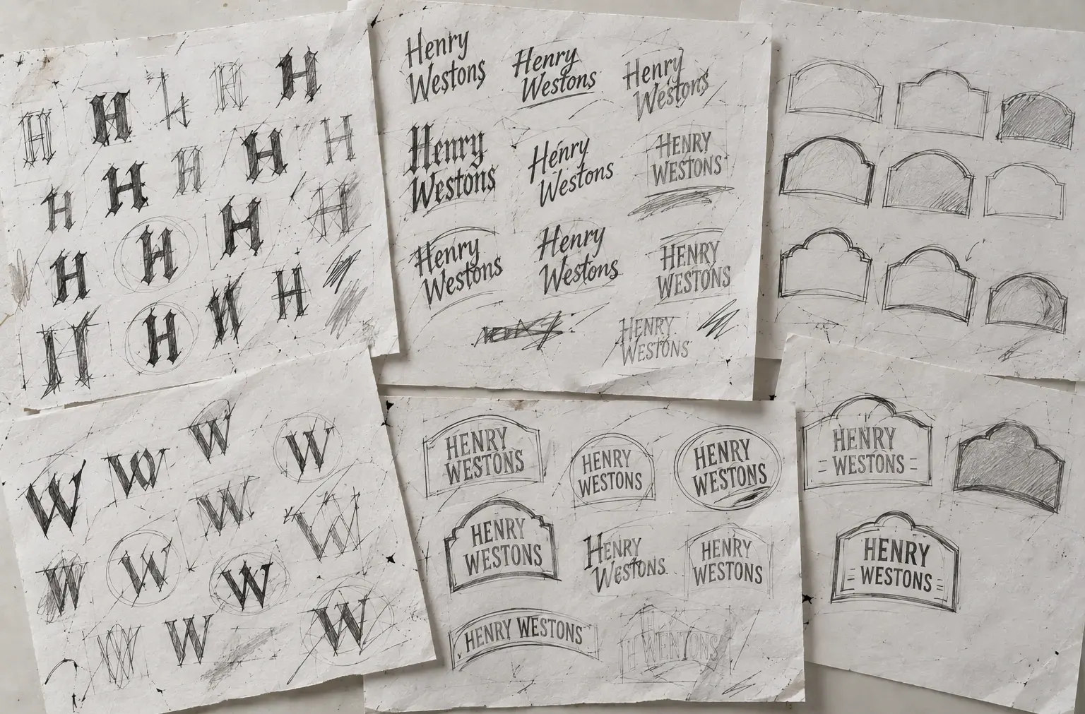
Logo Experimentation
To start the project, I began by exploring how I wanted the new logo to look through a series of rough hand-drawn sketches. I experimented with different “H” and “W” letterforms, typography styles, badge shapes and compositions, testing how the words “Henry Westons” could sit within each structure. These early explorations helped establish the key visual elements of the final identity, while keeping the process loose enough to develop and refine ideas organically.
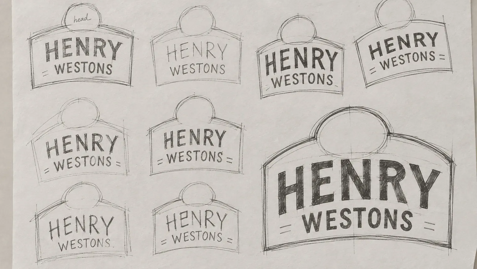

Early Digital Logo Variations and Development
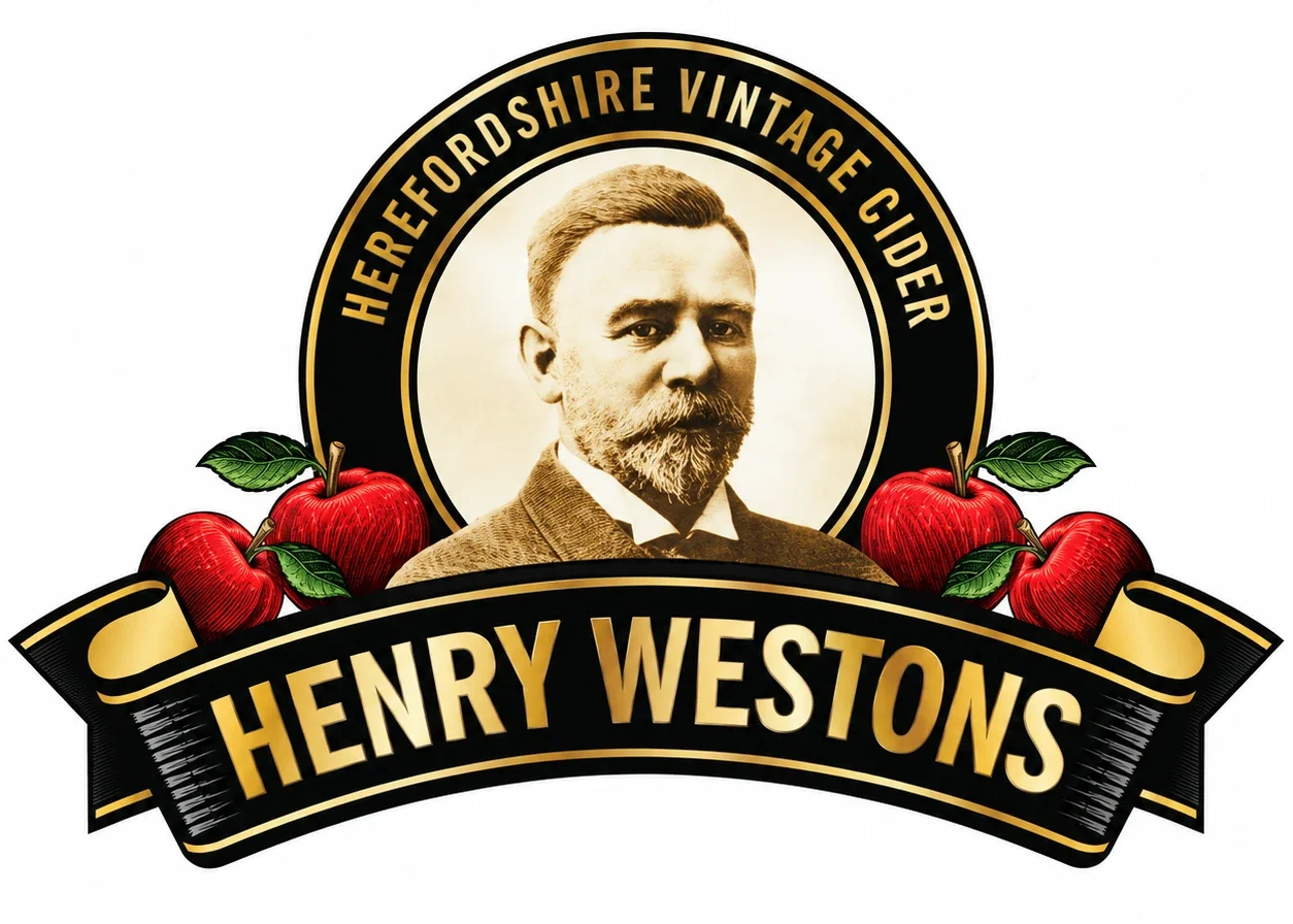
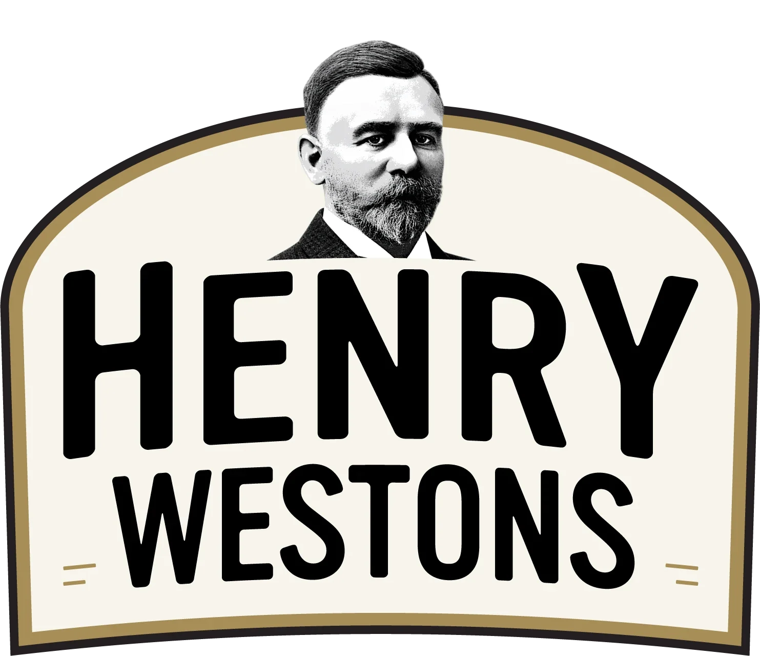
Chosen Logo
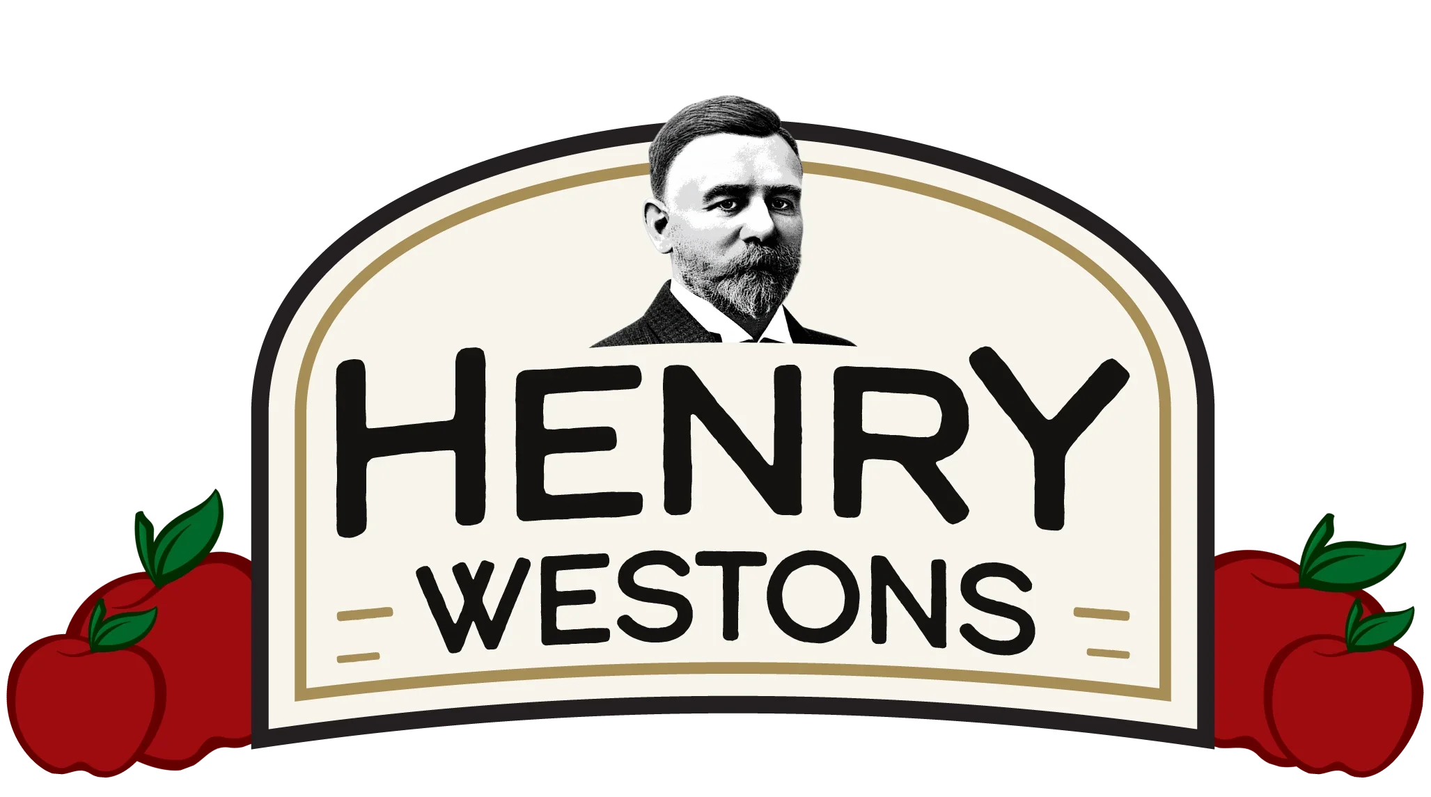
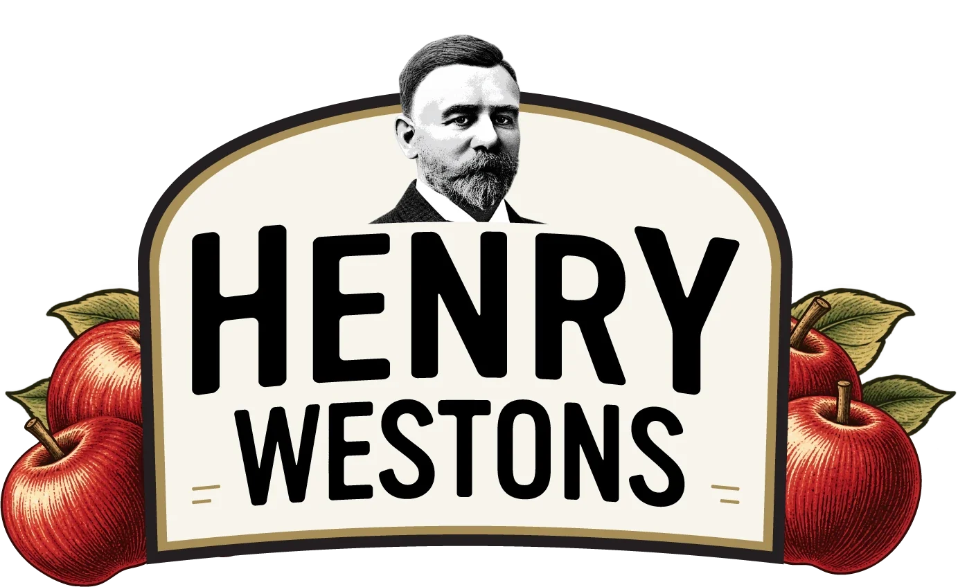
I ultimately chose to progress without the apples within the main logo, allowing the identity to feel cleaner, more modern and more versatile across different applications. Removing them gives greater emphasis to the Henry Westons name and portrait while creating a simpler, more recognisable mark. The apples are still retained as a key part of the wider visual identity and will be introduced across the bottle labels and supporting packaging, where they can add colour and reinforce the orchard connection without compromising the simplicity of the main logo.
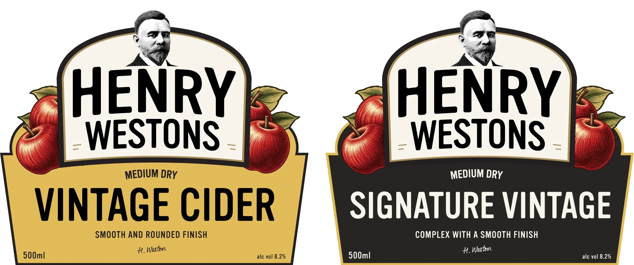
Label Applications
Label Variation
I redesigned the label with heritage in mind. The founder’s portrait and the Henry Westons logo sit together in a classic crest, so the brand’s history and its name read as one mark. The apples nestle against the crest on either side, and the information below is shaped like an apple basket, holding the fruit and everything the shopper needs to know: the style, the tasting note, the volume and the strength.
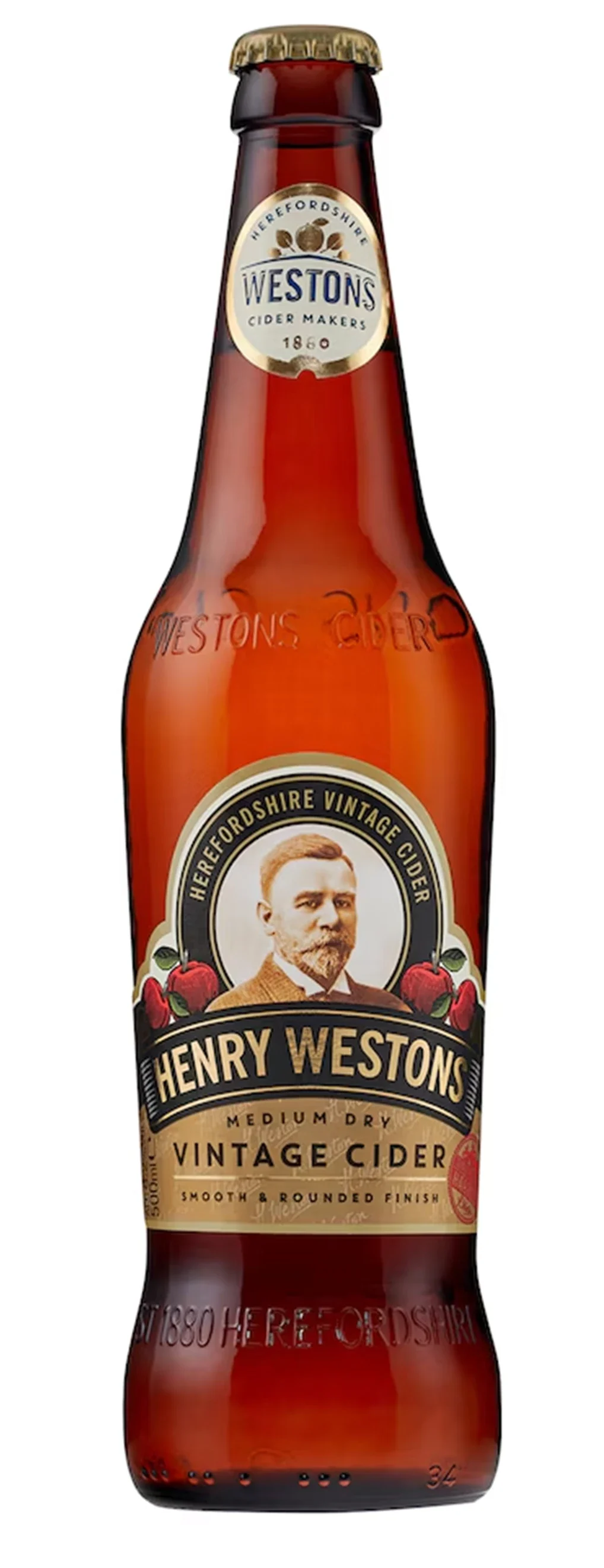

Brand Fonts — Vinyl OT
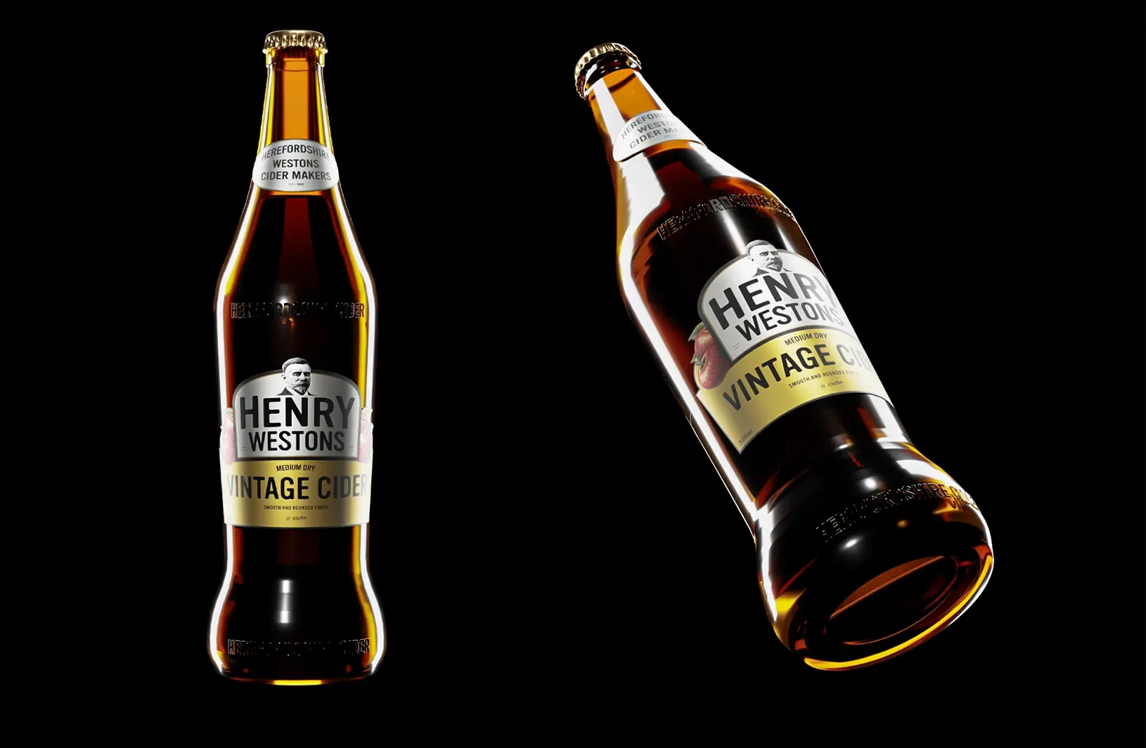
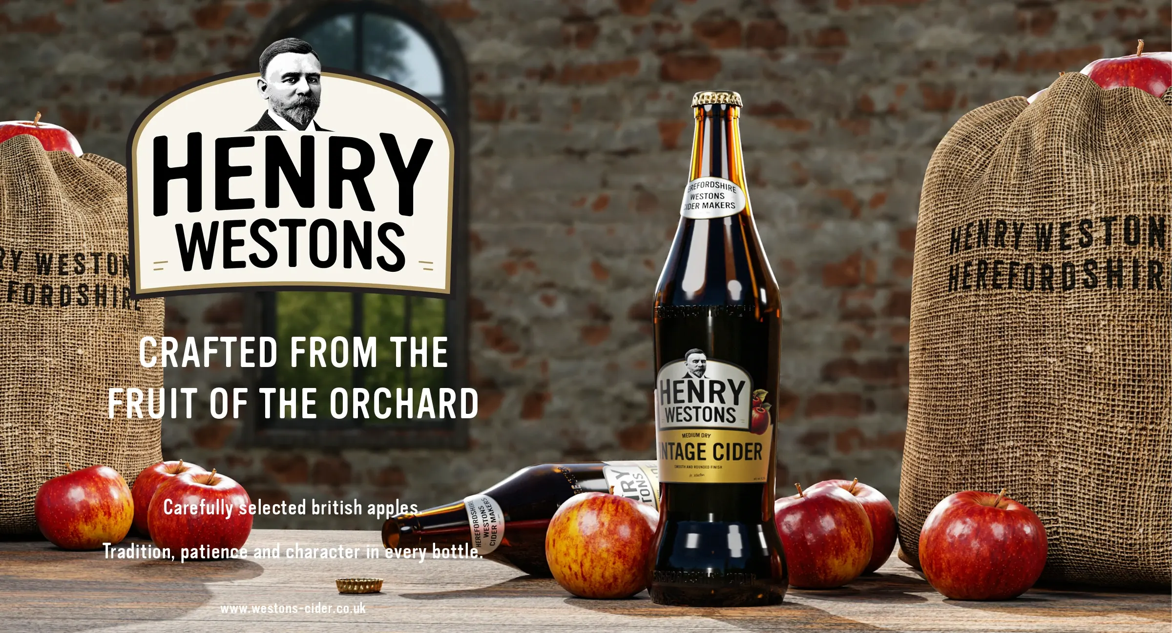
3D Modelling and Texturing of the Westons Bottle, along with Render Lighting Setup.
Crafted from the fruit of the orchard.
Reflection
In three days the project went from pencil sketches to a finished crest, two label variations and a 3D-rendered bottle. The aim throughout was restraint: keep the portrait, the cream and antique-gold palette and the vintage feel, simplify around them, and let the apples move from the logo onto the labels, where they carry the story of the orchard.
- Made with
- Blender, Adobe Substance Painter, Adobe Photoshop, Adobe Illustrator, Adobe After Effects, Adobe InDesign